Joint Effort | Branding & Illustration

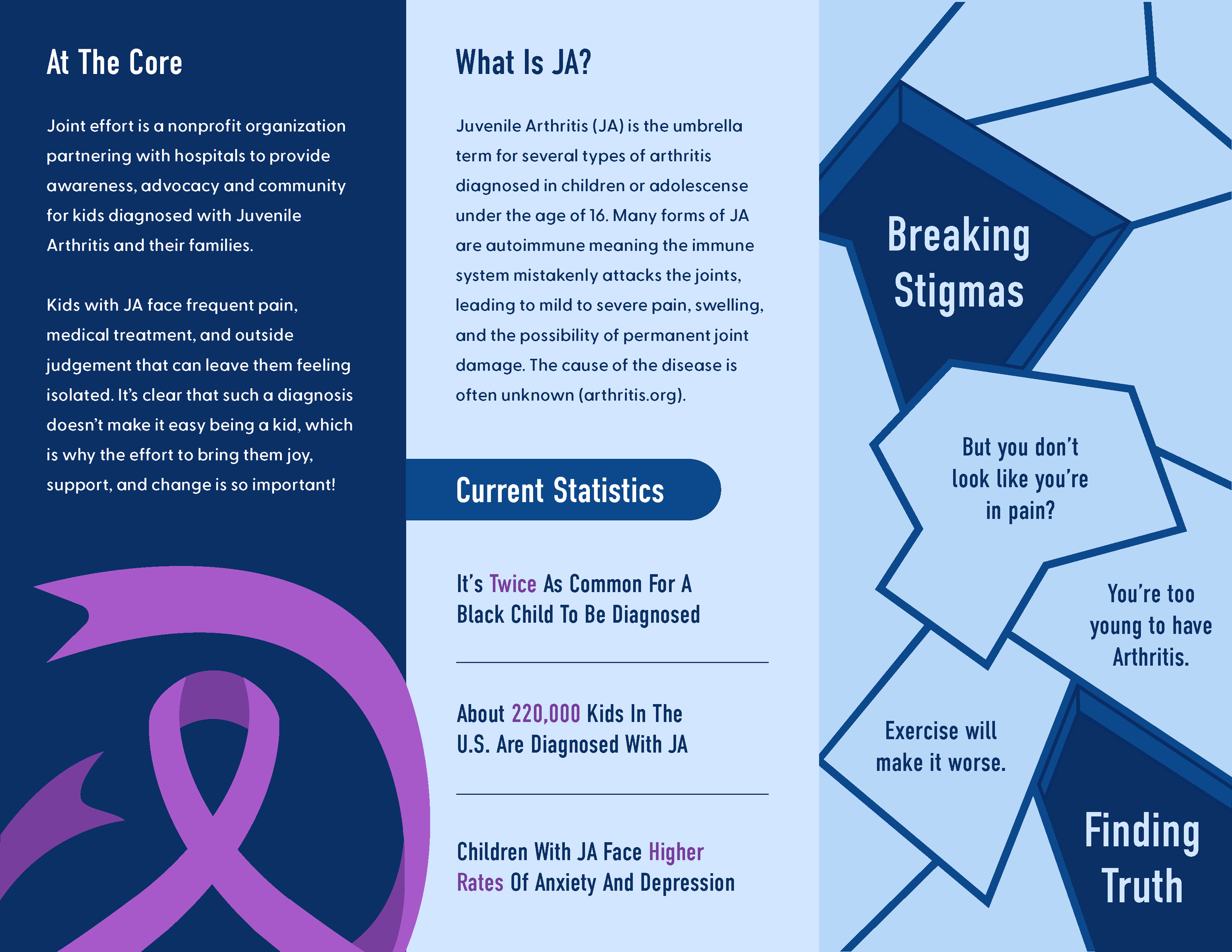
Joint Effort is a concept for a nonprofit dedicated to educating, supporting, and advocating for children with Juvenile Arthritis and their families. With both children and adults as an audience, the development of this brand required a balance. The result: an educational yet playful and heartfelt brand identity that is inclusive in design without losing its impactful purpose.

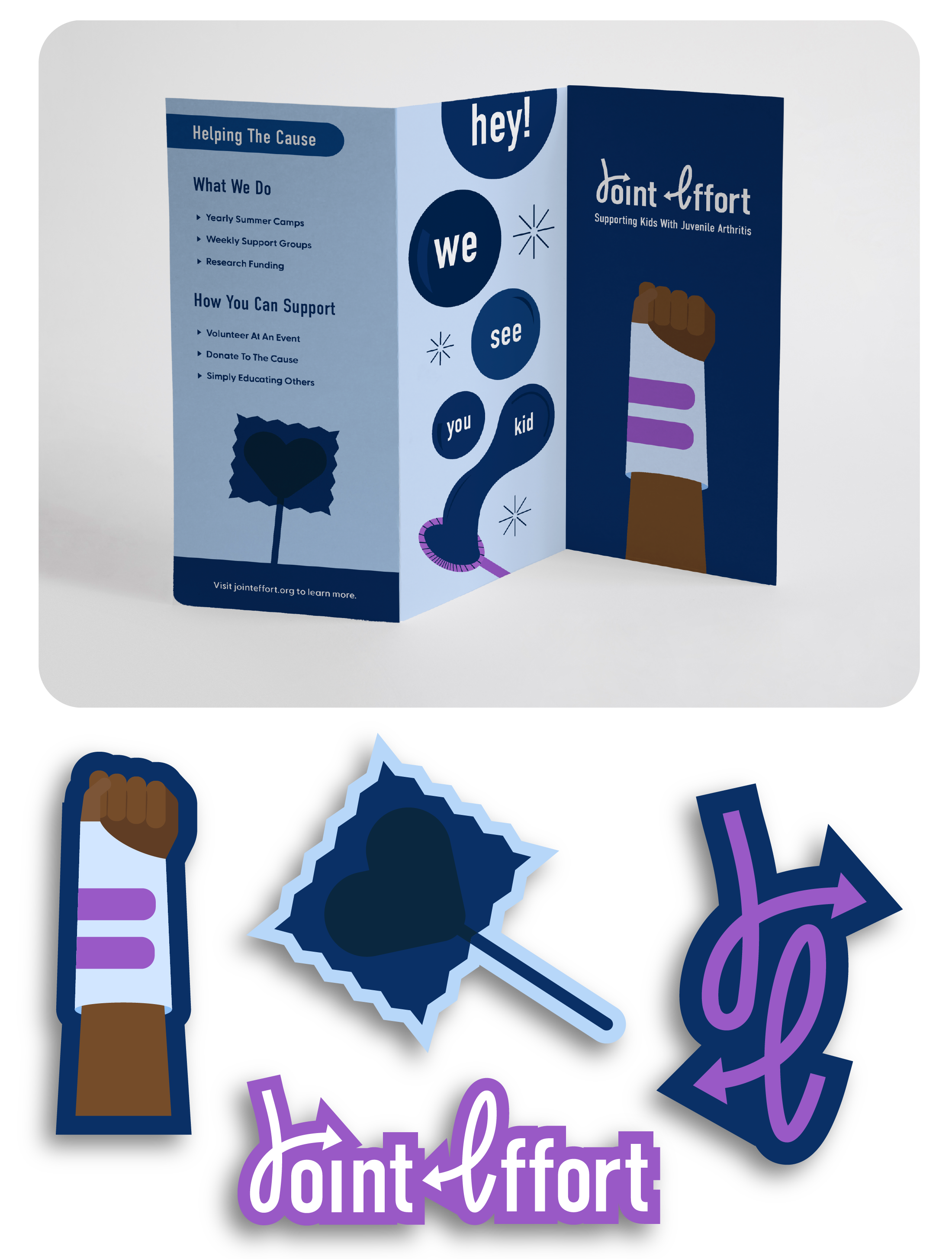
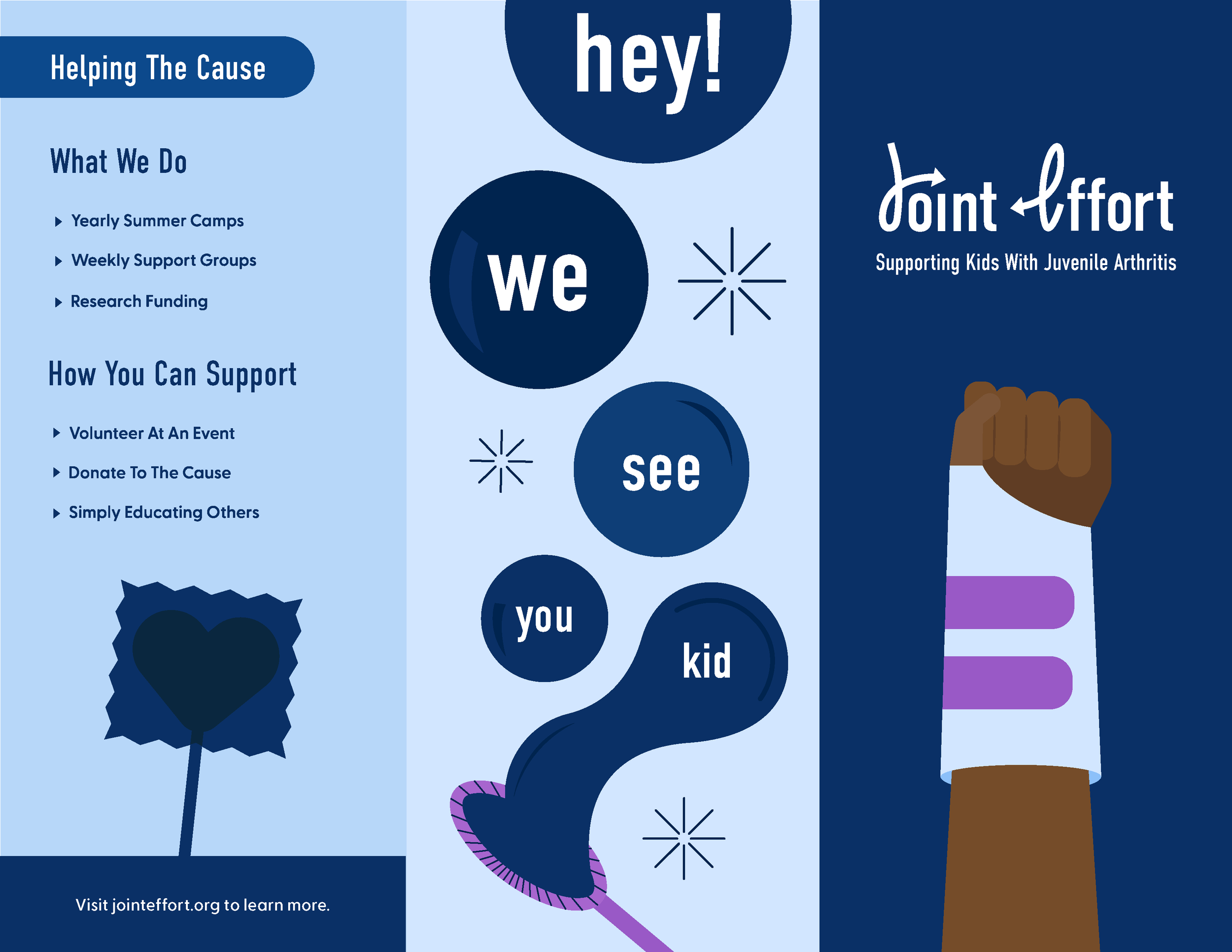
The deliverables include a primary and secondary logo, brochure design, and stickers.

This project hits home, as it was inspired by my own diagnosis with the disease at 11 years old. A time that forever taught me what it feels like to be unseen and isolated in circumstance, therefore, I hope this project can both enlighten and bring comfort to its viewers.
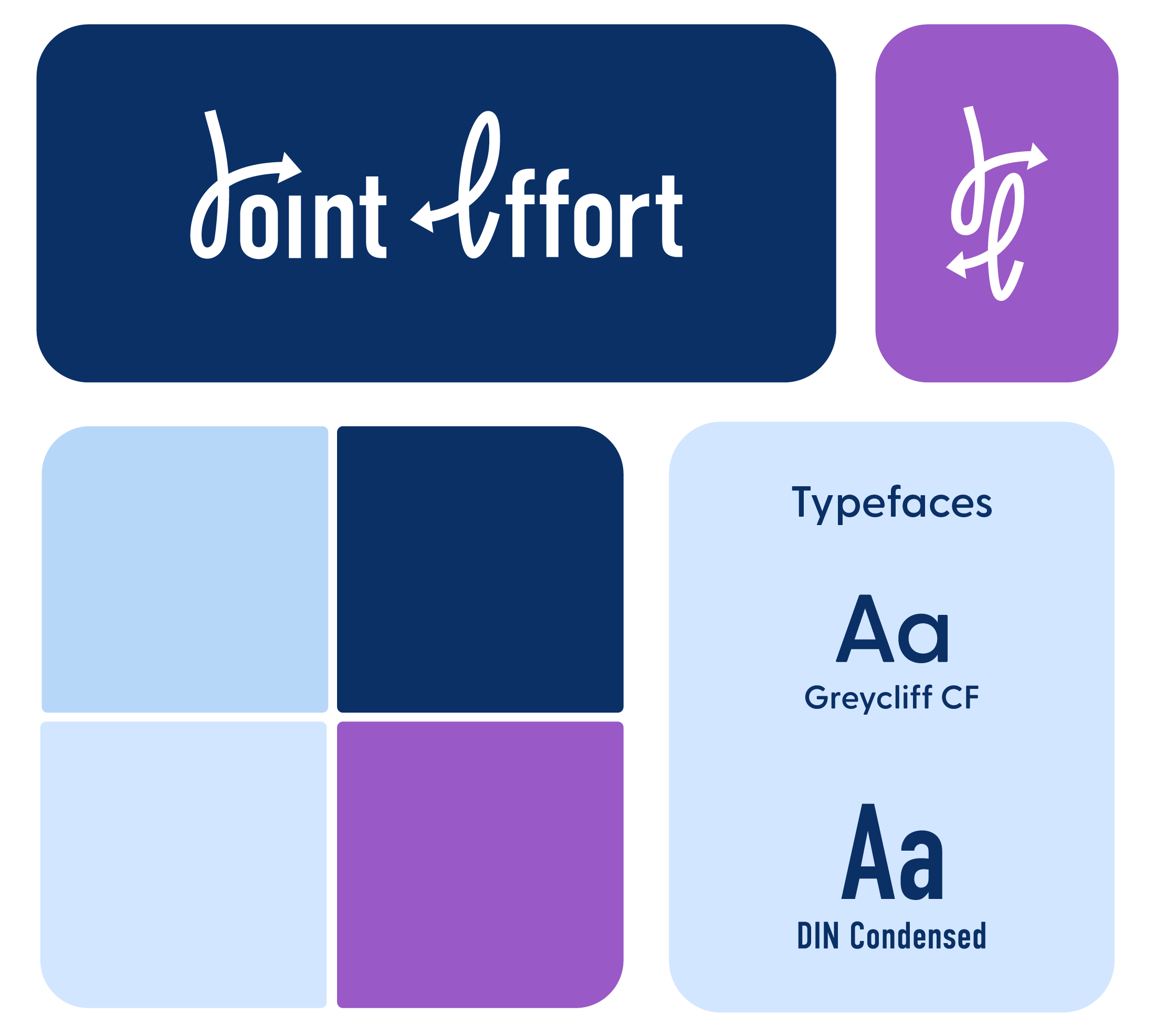
Color palette and font styles including 'don’t fret' in white cursive with arrows, and text styles for 'Typefaces,' 'Aa,' 'Grelcliffe CF,' and 'DIN Condensed.'
A digital graphic promoting a charitable cause supporting kids with juvenile arthritis. The image features the words 'hey!', 'we', 'see', and 'kid' in large fonts, with supporting text about helping the cause through activities like summer camps, support groups, research funding, volunteering, and donations. The design uses blue, purple, and brown colors, with icons of a raised fist and a flower, and includes a call to action to visit jointeffort.org.
A colorful infographic about juvenile arthritis, showing text about the organization, facts, statistics, and misconceptions, with geometric blue and purple design elements.
Brochure supporting a cause, featuring words "hey!", "we", "see", "you", "kid" and "don't effort" with illustrations of a clenched fist, a puzzle piece, and stylized font, promoting awareness and support for kids with juvenile arthritis.